Fresh New Look
Every couple of years I get an itch to remodel my website. I guess part of the reason is due to advances in technology.
When I created the website before this one five years ago, mobile devices were not nearly as prominent as today. The old site did not render well on mobile devices, and image scaling was quite poor to say the least.
The new site is mobile and desktop friendly. On a mobile device you should never need to scroll horizontally (except in code blocks), as this is considered the most user friendly experience when consuming content on a small screen. Switch to landscape mode and the content will reflow to fit the new width of the device, allowing you to see images in the highest possible resolution.
Since I have a lot of old content on this site, I have not yet had time to upload higher resolution images for all articles. Therefore not all photos will be awesome.
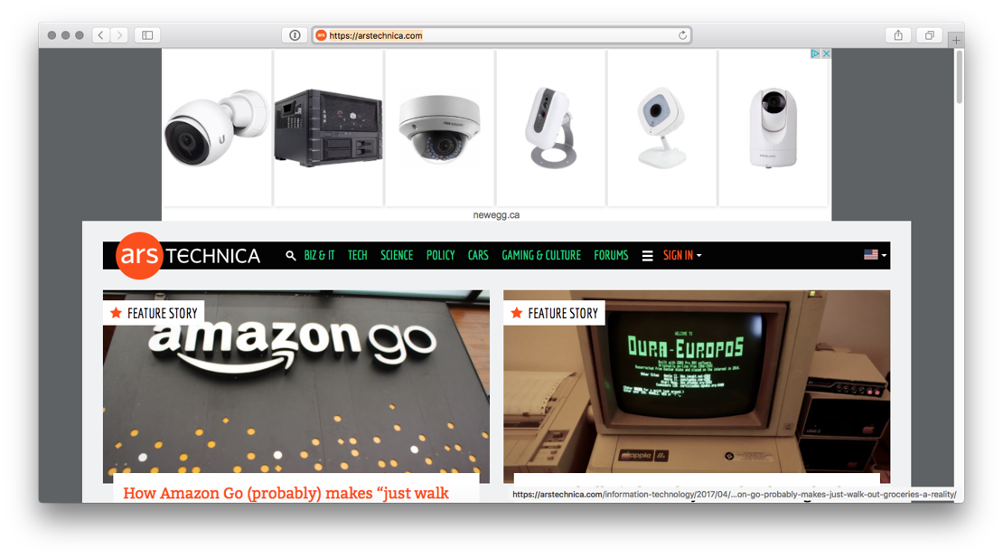
I have also tied in PWN Consulting more closely to the new site as it really is just another facet of my online presence. Some content has been stripped as another major motivation for changing things up was to have an uncluttered site. This site is about content - words and images, not ads. It feels like most of the modern web is oversaturated with intrusive ads and videos and other nonsense. To see what I am on about, just take a peek at some websites. Ars is especially bad these days:

Try scrolling down on this page - just terrible!